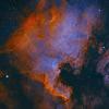
Reprocessed my M45 data and with more processing skills it is possible to have more saturated colours. But i think this might be a bit too much..... What do you think?
 M45 extra colour saturated. DSLR Image by Kees Scherer, on Flickr

Mariner 2

Posted 02 December 2016 - 07:48 AM
Reprocessed my M45 data and with more processing skills it is possible to have more saturated colours. But i think this might be a bit too much..... What do you think?
M45 extra colour saturated. DSLR Image by Kees Scherer, on Flickr
Hubble

Posted 02 December 2016 - 08:18 AM
More importantly, what do YOU think? Seriously, color (in general) is kind of a matter of personal opinion. However, my choice would be to reduce the saturation a bit and try to get rid of the red bias in the stars that are surrounding the Pleiades. In fact, it looks like there is a shift in the color balance between the center and edges of the field (blue in the center, red on top/bottom and left/right. Some of this is probably from the differences in the blue reflection nebula in the center and the warmer, background dust outside of the center, but the bias looks a little extreme to me.
It does appear, however, that you've got some very good data which should be able to be handled in a number of different ways to produce a range of really nice results (as you've just shown in the above image).
Viking 1

Posted 02 December 2016 - 08:38 AM
Saturation is taste + display device/method. It will look different probably on every user's monitor 
Personally I like quite a bit of saturation (both in daytime as in astrophotography) so to me this image is at least much much much better than all the blue background images without any star color
Where it gets a bit over the top in my opinion is when/where you get the reddish big vague colour blobs that don't seem to represent any real structure (dust or stars or...)
So I'd probably tone it down a bit on the background, but other than that; nice image! 
Ranger 4

Posted 02 December 2016 - 09:40 AM
Yes. Too saturated, IMO.
Mariner 2

Posted 02 December 2016 - 09:55 AM
If you like it, that all that matters. In the end, you have to suit your self.
Skylab

Posted 02 December 2016 - 03:24 PM
WOW this is just gorgeous to me!
Mariner 2
Posted 03 December 2016 - 03:52 AM
. In fact, it looks like there is a shift in the color balance between the center and edges of the field (blue in the center, red on top/bottom and left/right. Some of this is probably from the differences in the blue reflection nebula in the center and the warmer, background dust outside of the center, but the bias looks a little extreme to me.
I don't think so James, or maybe i misunderstand what you mean. The cluster illuminates a part of the brownish nebulosity and creates the blue refection nebula, the rest stays brown and darker....
Mariner 2
Posted 03 December 2016 - 03:56 AM
Saturation is taste + display device/method. It will look different probably on every user's monitor
Personally I like quite a bit of saturation (both in daytime as in astrophotography) so to me this image is at least much much much better than all the blue background images without any star color
Where it gets a bit over the top in my opinion is when/where you get the reddish big vague colour blobs that don't seem to represent any real structure (dust or stars or...)
So I'd probably tone it down a bit on the background, but other than that; nice image!
Thanks Christian! The reddish big vague colour blobs? Do you mean the brown nebulosity surrounding the blue reflection nebulosity? Because that is what it represents.
Mariner 2
Posted 03 December 2016 - 04:08 AM
Thank you all for the input, i have toned it down a bit. I think this should be about right (scaled down to stay < 500kb limit)

Viking 1
Posted 03 December 2016 - 04:16 AM
Saturation is taste + display device/method. It will look different probably on every user's monitor
Personally I like quite a bit of saturation (both in daytime as in astrophotography) so to me this image is at least much much much better than all the blue background images without any star color
Where it gets a bit over the top in my opinion is when/where you get the reddish big vague colour blobs that don't seem to represent any real structure (dust or stars or...)
So I'd probably tone it down a bit on the background, but other than that; nice image!
Thanks Christian! The reddish big vague colour blobs? Do you mean the brown nebulosity surrounding the blue reflection nebulosity? Because that is what it represents.
First of all I'll re-iterate that it is a matter of personal taste
what I find a bit unnatural looking is the background near those brown nebulosity. So not the nebulosity itself, that's perfectly fine. It's just that to me it seems the background through/in between the nebulosity looks a bit unnatural.
It's either background or fainter nebulosity that hasn't got enough signal yet.
I circled the areas

Viking 1
Posted 03 December 2016 - 04:17 AM

it is the green color in the inverted image
Mariner 2
Posted 03 December 2016 - 04:32 AM
I see what you mean Christian, i agree. So the toned down version is better. (Must be me, or my monitors, but i can not see green in the inverted image )
Explorer 1

Posted 03 December 2016 - 04:41 AM
It's very subtle I think, I do see it on my calibrated screen, but that doesn't mean a lot as it's 15 years old. My feeling is that the first version is a bit too much, as it seems that everything has way more colour (which would include a bit of the background). If you could tone the background a bit down with a mask (extremely difficult to make I guess in this case), it might still work. The second version is nicer regarding the background, but the dynamics of the colors in the first one (which are real I think), is less. Very difficult one this.
Edited by supernov, 03 December 2016 - 04:48 AM.
Viking 1
Posted 03 December 2016 - 04:55 AM
It's a very difficult fov to process. Somehow people usually don't seem to understand this and consider it an easy target..
I think I'd prefer a bit of a mix between your first version and second. and I fear it's not as easy as toning it down a bit. I'd try to process the stars, nebulosity and background separate as much as possible.
Not sure if you work in PixInsight, but simply taking the luminance of your image is already a really subtle mask. Depending on what you do you still need to subtract stars or stretch it a bit to get background dark.
but again, very difficult fov!
Explorer 1
Posted 03 December 2016 - 05:05 AM
Yes, exactly, to get a more "natural" saturation you need to process the different parts seperately for which masks are vital. I just think the dust close to the background signal is going to be very tricky. But maybe a combination of the first image, corrected a bit using masks with the second might work as well yes, Pixelmath might do some nice things as well.
Mariner 2
Posted 03 December 2016 - 05:07 AM
Yes i work in Pixinsight Christian, i have used a luminance mask. Inside Pixinsight Chapter 18 is explaining the Color saturation tricks and pitfalls and i use that book as a guide.

Viking 1
Posted 03 December 2016 - 06:19 AM
Yes i work in Pixinsight Christian, i have used a luminance mask. Inside Pixinsight Chapter 18 is explaining the Color saturation tricks and pitfalls and i use that book as a guide.
I see. You can already see now that you'll process the background along with the 'brown dust' if you use this mask. I don't think you can prevent this completely, but it shows that very very subtle masking and processing is needed in this region
Also I like a mask with structure but without stars, although this can be tricky to get right
Mariner 2
Posted 03 December 2016 - 06:41 AM
Yes i work in Pixinsight Christian, i have used a luminance mask. Inside Pixinsight Chapter 18 is explaining the Color saturation tricks and pitfalls and i use that book as a guide.
I see. You can already see now that you'll process the background along with the 'brown dust' if you use this mask. I don't think you can prevent this completely, but it shows that very very subtle masking and processing is needed in this region
Also I like a mask with structure but without stars, although this can be tricky to get right
Err, no. Transparent selects and red protects so with this mask i process the stars and bright blue nebulosity
Viking 1
Posted 03 December 2016 - 06:53 AM
Yes i work in Pixinsight Christian, i have used a luminance mask. Inside Pixinsight Chapter 18 is explaining the Color saturation tricks and pitfalls and i use that book as a guide.
I see. You can already see now that you'll process the background along with the 'brown dust' if you use this mask. I don't think you can prevent this completely, but it shows that very very subtle masking and processing is needed in this region
Also I like a mask with structure but without stars, although this can be tricky to get right
Err, no. Transparent selects and red protects so with this mask i process the stars and bright blue nebulosity
Yes of course. I thought you'd simply invert this mask to process the brown dust (and the background)
Overcast Observatory

Posted 03 December 2016 - 08:09 AM
I think the second revision looks excellent. Well done.
What method are you using to stretch? STF settings dragged onto Histogram Transformation? If you want the stars to be a little less intense using the MaskedStretch tool can achieve this. I have found it is a more controlled stretch than HT, but ultimately it will highlight the need for more integration time as Low SNR areas of the image will not stretch as much also. I use this as a guide on how much integration time I decide I want to get on a target. Using MS will control your Lum and Chroma noise and encourage you to get more data, which of course will help mitigate noise and improve overall SNR of your target.
That said, without any additional data, my only critique would be to control the noise a bit more. You can create a strong Lum mask (use HT to stretch the mask so that it is mostly white, with only the background areas looking grey or black) and apply this to your image. Invert the mask and run ACDNR. You can start with the default settings to see what you get, but this will temper your noise while protecting your nice crisp nebula.
EDIT: One more thing I would do is hit this with a round of SCNR. Some of your stars have a green tinge to them, and it will improve the color tones of your brown dust and improve the blue of your reflection neb.
Edited by ChrisWhite, 03 December 2016 - 08:12 AM.
Mariner 2
Posted 03 December 2016 - 09:03 AM
I think the second revision looks excellent. Well done.
What method are you using to stretch? STF settings dragged onto Histogram Transformation? If you want the stars to be a little less intense using the MaskedStretch tool can achieve this. I have found it is a more controlled stretch than HT, but ultimately it will highlight the need for more integration time as Low SNR areas of the image will not stretch as much also. I use this as a guide on how much integration time I decide I want to get on a target. Using MS will control your Lum and Chroma noise and encourage you to get more data, which of course will help mitigate noise and improve overall SNR of your target.
That said, without any additional data, my only critique would be to control the noise a bit more. You can create a strong Lum mask (use HT to stretch the mask so that it is mostly white, with only the background areas looking grey or black) and apply this to your image. Invert the mask and run ACDNR. You can start with the default settings to see what you get, but this will temper your noise while protecting your nice crisp nebula.
EDIT: One more thing I would do is hit this with a round of SCNR. Some of your stars have a green tinge to them, and it will improve the color tones of your brown dust and improve the blue of your reflection neb.
Thanks Chris! I use Masked stretch, followed by a Histogram stretch. I have not used any noise reduction for this image, i did use a round of scnr but with 0.8 setting so there is some green left. Thanks for the detailed tip with the L mask settings!


p088gll - Today, 08:06 PM
Cats & Casses
KurtV - Today, 07:56 PM
Experienced Deep Sky Imaging

MonogonMan - Today, 07:51 PM
Beginners Forum (No Astrophotography)
Dennis_Oz - Today, 07:40 PM
Solar Observing and Imaging

Nightowl99 - Today, 07:26 PM
Deep Sky Observing
HPaleske - Today, 07:19 PM
Solar Observing and Imaging


 Cloudy Nights LLC Cloudy Nights Sponsor: Astronomics |

