Jump to content

  •  

CNers have asked about a donation box for Cloudy Nights over the years, so here you go. Donation is not required by any means, so please enjoy your stay.

Photo

3Atlas (PDF) project:: 9, 11 and 13 mag sky atlas

This topic has been archived. This means that you cannot reply to this topic.
110 replies to this topic

#1 jr_

jr_

    Mariner 2

  • *****
  • topic starter
  • Posts: 223
  • Joined: 28 Jul 2003

Posted 14 May 2007 - 07:15 AM

A downloadable PDF sky atlas reaching 13 mag in three sections - first proof

I like sky atlases and cartography. In the last years, I have bought (and used!) most of the published atlases. However, I have not found the “perfect atlas” yet (probably, there is no ideal single atlas). Some years ago, I thought that the C section of the Herald-Bobroff atlas was just perfect (large scale, showing faint stars), but I have changed my mind. Sometimes it is not precise enough, in others there are too many objects and the codes are often skipped because I prefer using a book to pick up the DSO to see at the telescope (I mean, a book gathering tables of DSO data), instead of decoding complex symbols. I wanted much more stars.

Thus, two months ago I began to plan my own atlas. It is a set of three atlases (A,B and C maps), which I would like to share (free, or course!!!) with everybody as PDF files. I am now linking the intermediate atlas: an 11 magnitude star atlas. It is unrefined, with overlapped labels and objects, but nevertheless a very nice work. I hope you will like it, but note that it is my “first iteration”, not the final charts. I wanted constellation lines plotted, double stars like in Herald-Bobroff atlas, conventional symbols, neighbouring charts, optional color printouts, etc. This is a small portion of one of the B-charts.

Posted Image

My idea was to generate three complete atlases with my program CNebulaX (because of the amount of work, fully computer-generated: with no supervision o post-edition). This means that there will be problems with overlapping, and the fonts must be small but well readable. This weekend I finished the software and now I am able to generate (in a few minutes!) any customised atlas I wish, with index charts and numbers indicating the neighbouring and zoomed charts (B chart numbers in A charts, and C numbers in B charts); everything is automated. What I will show is just the first complete set, to discuss and improve it, but fully functional. I have tried it this weekend to catch Leo and Virgo galaxies, and it is really great.

The Atlas is indeed a three sections atlas, like the Herald-Bobroff one. The first one (A-section) is a set 25 A4 charts showing stars up to 9 magnitude, with 50º maps. The second one (B-section, linked below) is a set of 90 charts up to 11 magnitude, with 23º charts. Finally, the third section © includes 661 charts (8º each) up to 13 magnitude, far much more powerful than the Millennium Atlas, listing for instance all known planetary nebulae and open clusters, galaxies up to 16 magnitude, double stars up to 12.5 magnitude, etc. The fonts, I must say, are readable but VERY SMALL. For me is OK. Minor objects close to the threshold and printed with a very minute font, that can be read but the idea is use the next sections. Perhaps I will remove the labels in the “next iteration”. I have tried bigger fonts but I prefer more objects with smaller fonts.

The chart number is at the lower right area (large outline font). There are nine points sampling the nearest neighbouring B-charts, indicated with a smaller outline font in the borders (the corners and in the middle sides). Finally, you will see smaller outline numbers indicating the charts in the C section (just like in the Herald Bobroff or Uranometria 2nd. edition).

The 90 charts are in LARGE PDF files (=save them to disk before opening). If you want a good output, print them with no shriking at 600 DPI (I generated my own charts sending them directly to the printer for a best quality, and PDF charts are not so perfect):

Section B - charts 1 to 30

Section B - charts 31 to 60

Section B - charts 61 to 90

This is a four charts index chart:

Index charts for the B section (4 charts)

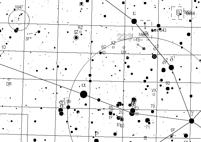
And here there are two sample charts taken from the 13 magnitude atlas (C-section) to give an idea. This section is still to refine, to eliminate duplicated entries. The problem is where to store it, because the PDFs will be VERY HUGE (700 Mb):

Sample chart of section C: chart 223 (the Hyades)

Sample chart of section C: chart 279 (M 15 area, Pegasus)

My idea is binding the charts making a book, with two-side charts. I want to print all the stuff before summer holidays; at least, I hope so...

I will link the A section probably tomorrow. The A section includes a selection of the best deep sky objects and it is very handy to plan quick deep sky sessions. The corresponding maps in the B section are overlaid on each chart. Quite comfortable to use, I think.

This is the way I generate the charts:

Posted Image

Double stars are labelled with a double magnitude/distance code. For instance 1C indicates a disproportion in magnitudes between main and secondary stars of 1.0 to 1.9 magnitudes, and C: 1.5 to 5 arcsec separation (A=<0.5", B=0.5-1.5", C=1.5"-5", D=5"-15", E=15-60", F=>60"). The remaining kind of objects are labelled with standard names.

#2 mister_wavey

mister_wavey

    Explorer 1

  • -----
  • Posts: 87
  • Joined: 11 Sep 2005

Posted 14 May 2007 - 01:56 PM

wow!

#3 jr_

jr_

    Mariner 2

  • *****
  • topic starter
  • Posts: 223
  • Joined: 28 Jul 2003

Posted 14 May 2007 - 03:26 PM

The PDF file for the A set (25 charts up to 9.0 mag, 50º height) is stored in the following link:

Section A - 25 charts up to 9.0 mag with pointers to the B section

The index charts for the A section is:

Section A - 4 charts showing the distribution of the A charts

Again, print the maps with no shrinking at 600 dpi. In the previous message you will find the links for the B section (11 mag).

Finally, the distribution maps for the C charts are here:

Section C - 4 charts showing the distribution of the C charts

#4 Starman1

Starman1

    Stargeezer

  • *****
  • Posts: 65,335
  • Joined: 23 Jun 2003

Posted 15 May 2007 - 09:13 AM

Excellent start. Referring to the C Atlas (my preference because of scale):
1) For readability, the page numbers should be outside the chart area, even if it means shrinking the amount of chart area per page.
2) The labels should be of uniform size. This may result in even more overlap of labels than in your samples. For the charts to be readable in the field, the overlap of labels needs to be controlled. If it is, the charts become usable.
3) Many of your design goals are excellent. You have some real potential, here. Here is a link to what was going to be the best atlas ever printed:
http://www.skygx.com/
But it looks like it will never go to press, now, so you can step right in. You should note the design goals and see if any of them make sense for you. Also look at their sample pages.
4) I printed an atlas from Megastar 5.x a while back, with 6 degrees per page, and the scale was excellent for the display of DSOs, but quite unwieldy in the field. Your scale would be better. Be sure there is slight overlap from chart to chart, and be certain the atlas contains ALL the star clusters in Archinal & Hynes book "Star Clusters" (Willmann-Bell).

Nice start. :bow:

#5 jr_

jr_

    Mariner 2

  • *****
  • topic starter
  • Posts: 223
  • Joined: 28 Jul 2003

Posted 15 May 2007 - 11:57 AM

Hi Don,

The true core of the project is the C section. The A and B sections are good atlases by themselves (especially the B one), but what I originally wanted is the big 13 mag. Section ©. I have already printed (and stored in a plastic sheet folder) the A and B sections so that I can use them as my new main atlas, and I hope to print the C section in two weeks to have it bound as book before summer holidays. Fortunately, most of the hard work (in programming terms) is already done; my last problem is to check the databases to finally use and perhaps compile a common mixed database.

There is a small problem with the quality of PDF with regard to the direct CNebulaX printouts. What is printed from the PDF is slightly smaller and has a slightly less quality than direct printouts, but quite good nevertheless.

I know the SkyGX charts, but honestly, I want to have a more compact atlas. The SkyGX prototype charts leave too empty space and this means more charts (=more heavy and expensive): each map occupies less than 40% of the paper, leaving empty space and duplicating unnecessarily symbols and extra-growing the size of the atlas. I want to have as much power (stars, deep sky objects and map scale) as possible, but not a too heavy/bulky atlas, so that it be useful in the observing sessions.

Are you sure you prefer less chart area to put the neighboring labels out of the map? I wanted to have the labels of the charts of the next zoom level in the middle of the charts so that be easy to move to the next set. The side labels can be printed out of the map; that is no problem. I can check the look of the maps. Or I can print empty areas surrounding the numbers to make them easier to read. I can prepare sample charts to show and decide.

There is a quite good (=generous) overlapping area between charts, I think that there is no problem in that sense. Is very easy to navigate between charts and sections. I have prepared three new one-chart indexes, easier to use than the current ones; I will link them tomorrow.

I have not printed –still- all objects I want in the final charts; I have set some restrictions that I still have to revise. For instance, Pease 1 is not printed in the sample C chart within M15 because I set to reject all planetary nebulae with less than 1 arcsec and this nebula has no size data in the current database. But my intention is to be comprehensive (except in the case of galaxies).

To me, the main problem is the minor fonts, and overlaps. The usual Arial Narrow font is good to me, but threshold objects are labelled one point smaller and thus become too small. Well, this is a first proof,as I mentioned: time to discuss and improve…

#6 Glassthrower

Glassthrower

    Vendor - Galactic Stone & Ironworks

  • *****
  • Vendors
  • Posts: 18,608
  • Joined: 07 Apr 2005

Posted 15 May 2007 - 03:55 PM

:bow:

Awesome work Jose. Now I have to go out and buy another ink cartridge for my printer!

The Mag-11 atlas is exactly the "depth" I need for my small scope.

Nice job and thanks for sharing! :waytogo:

Regards and clear skies,

MikeG

#7 jr_

jr_

    Mariner 2

  • *****
  • topic starter
  • Posts: 223
  • Joined: 28 Jul 2003

Posted 16 May 2007 - 12:29 AM

Hi MikeG,

The 11 mag atlas is quite close to the ideal atlas for field use. When I use other atlases (typically 9 mag atlases such as Uranometria or Herald-Bobroff), I frequently miss some more faint stars to locate exactly the object. This is the reason to go beyond this limit in the B-atlas.

I was using it last saturday night to spot galaxies in the Coma-Leo-Virgo area. I was looking for 12.5 to 13.5 mag objects with my 150 mm refractor (the night was good but far from exceptional), and in all cases, even for quite threshold targets, the atlas gave me enough reference points to locate them very easily. I was really satisfied with the performance: it was better than I originally thought. My initial idea was completing the hard searches with the 5800 minimaps (as I usually do), but with the new atlas was not necessary, except in one instance, just to confirm it. So the success percentage as "standard-alone" atlas was really good.

The only point is to get a printer able to reproduce the charts with the same accuracy I have got in the direct printouts. In a 600 dpi laser printer the charts are excellent. Larger resolution gives perhaps too thin stars.

I have also generated some proof color maps with a laser color printer. Color maps are even nicer (overlapping is less problematic), have a look to this:

chart B-23 in color (proof color combination)

...although obviously I am planning a B/W set.

IMPORTANT - I have replaced the A-charts with a new set with a 5º grid (instead of 1º grid) and smaller stars. The first set was too crowded and the charts are now more readable. Have look and tell me the impressions. I hope you will like it. At least I think that now is closer to how I like. Up to the moment, the changes to implement seem to be more clear (outer?) adjacent chart indicators and font sizes.

#8 Senpai

Senpai

    Vostok 1

  • -----
  • Posts: 129
  • Joined: 20 Oct 2006

Posted 16 May 2007 - 04:50 AM

Hi, Jose!
Very interesting! Is it possible to share the color version of the B-atlas? With slightly more dimer coordinate greed.
I think, the B-atlas is all I need with my 4-6-8" newtonians.
By the Way! I know how to share the C-version without the huge hosting. Divide the C-Atlas into 50mb fragments and share each 2 sequent fragments for a week or less. You can share all the atlas in 1 or 2 months.
After that we can put the fragments on the other different servers (acounts) and publish there the links.

#9 jr_

jr_

    Mariner 2

  • *****
  • topic starter
  • Posts: 223
  • Joined: 28 Jul 2003

Posted 16 May 2007 - 06:10 AM

Hi Senpai,

Yes, naturally, I can prepare it. Tell me the color set you would like. I have not tested the current colors in the night, but I am sure that the red should be absent (except -perhaps- a dark red for dimming the grid keeping a soft visibility). The best would be that you suggested a color set (RGB values would be OK); the categories to be defined are in the picture included in the first message. Then I would generate a proof and if it is OK, the whole set of charts. I can generate the color version immediately, no problem.

I need a way to send (or share) the whole color files. I have all my website nearly full, and the colours set could mean 100 Mb, which I do not own.

I will start to generate C-charts probably next week.

#10 PEterW

PEterW

    Gemini

  • *****
  • Posts: 3,327
  • Joined: 02 Jan 2006

Posted 16 May 2007 - 07:07 AM

Genius. Clouds in the UK, so not had a chance to play with them. this project gives you something for each category of user from binoculars to big dobsonians. Also as you pront it yourself, you only need to take the parts you need into the field, reducing bulk.
The only issue I had was the overlapping of the labels in crowded fields, but this has already been mentioned. Some form of HB 'visibility index' might be useful, but probably not easy to implement?!

Will the wonders never cease! All the best

PEterW

#11 Arbacia

Arbacia

    Apollo

  • *****
  • Posts: 1,057
  • Joined: 18 Apr 2007

Posted 16 May 2007 - 07:12 AM

Hi Jr_ very nice work indeed!

Don't use red. Use a couple of greens as they will appear greysh under red light (like the Norton's star Atlas). You can also use blues. Use as few colors as possible and the grid as dim as possible.

Saludos,

Patricio

#12 PEterW

PEterW

    Gemini

  • *****
  • Posts: 3,327
  • Joined: 02 Jan 2006

Posted 16 May 2007 - 07:13 AM

You need more storage space! Maybe put the files in the 'internet archive', archive.org so they have a good chance of maintaining their presence in cyberspace. With colour you can make the small map numbers more obvious. Maybe you could lightly colour shade the milky way in (the single contour line looks a bit like a constellation line at the moment). Colour looks like the way it'll end up finally.

Cheers

PEterW

#13 Arbacia

Arbacia

    Apollo

  • *****
  • Posts: 1,057
  • Joined: 18 Apr 2007

Posted 16 May 2007 - 07:19 AM

what about sharing the file in emule?

#14 jr_

jr_

    Mariner 2

  • *****
  • topic starter
  • Posts: 223
  • Joined: 28 Jul 2003

Posted 16 May 2007 - 11:54 AM

(PEterW) Good to have news from you again!!! I sent you an email a week ago with the first proofs (once finished successfully the promotion), but I didn't get any answer up to now. I think that the 11 mag atlas is an excellent starting point, and the 13 mag atlas, perhaps the definite answer for almost any deep sky object. Comprehensive, powerful, comfortable and completely free.

The B linear scale is similar to sky atlas 2000, but in more convenient A4 pages. I use the A and B sets as main atlas. It is small and easy to carry, there is no need to separate them: even if you use binoculars, sometimes you will want faint stars to catch the object, I am sure. My idea for the A section was offering a selection of the best objects for quick observing sessions. It is the same as when I use the Sky & Telescope Pocket Sky Atlas: it shows too few stars, but the object selection is quite good. I wanted a good slection, but more power.

I have dumped the charts in a laser printer and stored the charts in a folder with plastic sheets to protect them. My idea is bind the C section in a single volume. I do not think that the visibility indexes should be included in the maps, but in the accompanying tables.

(Arbacia) I will place the color C-charts in emule, good idea. If anybody could share his/her copy in that way, it can be of help to others. I have nearly exhausted my web space, and I have not finished to place all the stuff. I can replace the monochrom versions by the colour ones, but I have no place to store both of them.

I will prepare some colour charts to discuss and decide. This will be the best. Orange color for the grid was still visible in the dark but not disturbing. What colors and categories would you prefer?

#15 Starman1

Starman1

    Stargeezer

  • *****
  • Posts: 65,335
  • Joined: 23 Jun 2003

Posted 16 May 2007 - 12:52 PM

After further thought, I have some comments:
The scale of the Mag.13 charts © is excellent, but the number of stars is unnecessarily large. This scale of chart with stars only to Mag.11 would be fine--less cluttered, and easier to use to search for DSOs. Also, in areas with lots of galaxies, the stars wouldn't make the galaxy designations as hard to read.
But you will definitely have to address label overlap. In areas with galaxy clusters, the charts will simply be unreadable.
Frankly, I'd stick to Black and White, because while making designations in color helps the visibility of the charts in daytime use, it actually hurts the ease of use in the field. I've used color atlases in the field at night, and far prefer B&W for ease of reading under red light.
In essence, a Uranometria 2000.0 atlas with stars to Mag.11 would be a formidable atlas for big scope users. You've got the scale, and the information (I hope your NGC data comes from the NGCIC.org and the star cluster info from Archinal & Hynes "Star Clusters"--otherwise, you will have hundreds of coordinate errors). Work on the labels, and the charts could be the ultimate printed atlas.
I created a sample chart of the M1 area at 8 degrees per page with stars to Mag.11. It's REALLY crowded in the Milky Way at this scale.

#16 Senpai

Senpai

    Vostok 1

  • -----
  • Posts: 129
  • Joined: 20 Oct 2006

Posted 16 May 2007 - 02:09 PM

Hi, Jose!

IMHO, the coordinat grid is realy mast be as dim as it possible, may be, gray.
Also I think, the constellation borders (dashed) also mast be dim, may be, also light gray? Constellation figures and names - light green.
Big nebulas are blue - is normal.
Milky way - light blue (or dashed blue).
Galaxies, smll nebulas, open and globular clusters must be black contured.
So, it is normal to colorise all the additional info, and leave in b/w the main objects of the map - stars, DSO-s, and labels for good visibility in the field.
The colors must be "clear" - red, blue, green, and black and the dashed/dimed variants of the main 4 colors (light green, light red, light blue, gray) to maximise the resolution and the quality of the prints. Color combinations will make the objects more diffuse, not sharp.
Yes, red color is not good for the night observation!

#17 PEterW

PEterW

    Gemini

  • *****
  • Posts: 3,327
  • Joined: 02 Jan 2006

Posted 16 May 2007 - 02:38 PM

JOse, sorry for the delay in replying. Lots on at work, moving buildings, moved flat and baby son is getting more of a handful. Great bit of work, you keep excelling yourself! I see this post is now a sticky... congrats! I wonder if CloudyNights could host the final version? My broadband supplier selectively blocks Peer-2-peer traffic, but someone ought to share it to help speed up distribution.

Would you say the A section is a 'binocular atlas'? Another suggestion would be to label very large objects with a 'label on a stick' like the double-stars, so it is easy to see what label the large object has.

The more people we can get to make suggestions, the better the final product.

All the best

PEter

#18 Arbacia

Arbacia

    Apollo

  • *****
  • Posts: 1,057
  • Joined: 18 Apr 2007

Posted 16 May 2007 - 04:24 PM

No red color!!!! (neither orange or mauve)
under the red light will be "white" as the background white paper. Just use a red marker and test your writing under the red light.

keep colors scheme as simple as possible, under red lights "todos los gatos son pardos" (Spanish proverb, a translation should said something like "All cats are grey in the dark" menings that no one will notice)

#19 PEterW

PEterW

    Gemini

  • *****
  • Posts: 3,327
  • Joined: 02 Jan 2006

Posted 17 May 2007 - 02:48 AM

I think that colour done well would be very useful. jr tests his schemes in the field, so they should work. the different colours in the dark allow different levels of grey to be seen, rather than having to just print it grey in the first place. So we get a functional chart at night and one that is clearer and easier to use in the daytime.

Thanks

PEter

#20 jr_

jr_

    Mariner 2

  • *****
  • topic starter
  • Posts: 223
  • Joined: 28 Jul 2003

Posted 17 May 2007 - 01:25 PM

Hi everybody,

I am sorry for the delay. I have been trying several color setups and making some corrections. I have generated a set of charts for section A in color. This is the link of the new set:

Section A in color / 300dpi

I have to replace the driver to get 600 dpi color maps. I resampled them but they are still less accurate than the older charts. I didn't print the new chart set, just seeing the look on the screen (the old set is in the web still).

(Arbacia and Senpai) The grid is grayish now and I have avoided red colors as you have suggested (although I am not imaginative enough to design a good color set, I am afraid); only a deep red but with blue/green components has been used in galaxies. I can modify the colours as you prefer. Just tell me your preferences.I have used in the field only the BW set with extraordinary results. The best color set (=the appropriate color combination for night observing) for color charts is unknown still for me. I can make the proofs you want, no problem. Senpai, I personally prefer use the red color in the desktop, but during the night it will make the object invisible.

I tried my (about 10) sample colour charts in the darkness. The orange grid was barely visible with a LED flashlight, and my conclussion was that I need to design very carefully the colors before proceeding; so I went to the BW charts and delayed the color matter to next proofs. Printing in color makes the use in night conditions much harder. A good color combination is absolutely essential.

What I have linked is just a proof, but will require a good color printer to get a neat vector representation. I printed several charts in an HP Color LaserJet 2605 and the results were fantastic, but I cannot use that printer for reproducing 660 charts!!!. My final C charts (I mean my personal set) will be BW, but I can distribute colour charts, what you prefer.

In my opinion, colour outputs are nice for consulting at the desktop, but I the BW printouts are more functional in the field and cheaper to reproduce. But there is no problem in making colour outputs (except the web space to store the files).

I have thought a procedure to move the labels (not the best one, I am sure), although I still have to think about it. This will require some weekends of work, I am afraid, because the objects should be drawn with a completely different system.

About storage, I can share the files from my desktop PC with emule. I use to work with a notebook, so there is no problem in leaving the files in the desktop PC (no interference in my work), although this is a temporary solution. I am not using emule, but I can. I would consider any alternative we could find. My intention is to help, and any solution is welcome.

(Peter) For me, the whole A and B section is a binocular atlas. The A section shows only the brightest objects ( I can even restrict more the selection conditions). So it is just to know the best to see in a quick way. The B charts are the "horse of battle", the most useful for general purpose. And the C charts, gives the power we need to tackle really hard objects. Most of time I think that the B charts will me enough.

I would like to print the Milky Way in soft blue as in the Sky Atlas 2000. Or even better: getting a more accurate isolines set. Well, another good idea to add...

(Starman) I have tried 11 to 13 magnitude charts. At 8º, the 13 charts are excellent for galaxy fields, but too cluttered for Milky Way fields. And the 11, insuffcient for GX fields but quite OK for MW fields. I prefer having reference stars, as much as possible. I think that the best solution is adapt the magnitude to the charts making a small survey before printing each chart. But perhaps this solution is not ideal for everybody (mag will vary according to the chart).

I am planning to replace the labels surveying the surroundings, as mentioned before, but it is quite hard to design something giving response to the infinite variety of overlapping situations that can happen in the plots. It not easy at all, and my solution probably will be only partial. I cannot revise manually the charts, that would be just unfeasible. Well, we will see.

I coincide with you on my preference on BW charts.

The C set is using the NGC and IC data from the NGC/IC project; the database for this section is a new one (=less than six months old), and I included the revised cataloges by the NGC/IC project. However, I am not so sure about the A and B section because the database is a mixed one coming from an older source created during the NGC revision process. It certainly includes identity corrections, but surely not all of them. Note also that A and B charts includes not all the NGC and IC, and identity corrections are less probable for bright objects. The C charts are completely correct in that sense, and I can replace NGC or IC data by the NGC project in the next proof. My database system is flexible and allow modifications easily.

I will prepare testing maps of the C set to discuss on the number of stars.

#21 Senpai

Senpai

    Vostok 1

  • -----
  • Posts: 129
  • Joined: 20 Oct 2006

Posted 17 May 2007 - 06:08 PM

This is my variant of the color scheme:

Clusters - RGB 0,100,50
Galaxies - RGB 100,0,25
Nebulas, Milky Way - RGB 0, 50 100
Constellation borders, names - RGB 60,90,60
Coordinat Grid - 40% black, or RGB 60,60,60
Stars, star labels - 100% Black
Variable stars, doubles labels and markers - RGB 100,50,0

The sample map (hypotetical) in printer colors
Posted Image

Or to switch the colors of clusters and variables:
Posted Image

Your opinion?
Who can test the schemes on the color prints and the red light? I hope, the schemes must be readable.

#22 Mark Smedley

Mark Smedley

    Explorer 1

  • -----
  • Posts: 76
  • Joined: 02 Mar 2005

Posted 18 May 2007 - 01:54 AM

Hi Jose

The charts are looking very good for a first iteration.

I must agree that the chart numbers must be printed on the outside of the chart. The other thing I have noticed is that the RA printout is too cluttered on the A section charts, I would only print them out every 30m at the very most.

I will have a go at converting the milky way outlines again now that I have more time on my hands as my rainy season has started again.

As for distributing the files the easiest is probably something like rapidshare.com, but you will have to limit the files to a maximum of 100mb at a time. The best thing is that it is free.

Mark

#23 Tony Flanders

Tony Flanders

    ISS

  • *****
  • Posts: 23,364
  • Joined: 18 May 2006

Posted 18 May 2007 - 08:15 AM

This is my variant of the color scheme:

Clusters - RGB 0,100,50
Galaxies - RGB 100,0,25
Nebulas, Milky Way - RGB 0, 50 100
Constellation borders, names - RGB 60,90,60
Coordinat Grid - 40% black, or RGB 60,60,60
Stars, star labels - 100% Black
Variable stars, doubles labels and markers - RGB 100,50,0


In my opinion, using any shade of red or orange for something that you want to be visible at night on a star chart is asking for trouble. That's especially true for labels. Even if it looks OK to you by red flashlight, it may not to somebody else. Remember that different printers print colors differently!

At Sky & Telescope, we use a red ellipse with a black outline for galaxies. By red flashlight, the red interior disappears completely -- which is fine, because the black outline still shows well.

#24 Senpai

Senpai

    Vostok 1

  • -----
  • Posts: 129
  • Joined: 20 Oct 2006

Posted 18 May 2007 - 08:34 AM

Yes! I know!
That's why I use the combination of colors (not shades of red). Galaxies - RGB 100,0,25 - is R and B combination.
Yes, it would be better to use black outlines and color fills, but, as I think, it is imposible or hard to implement in 3Atals.
Newertheless, it is just a offer, and needs some test. May be, more blue in color
Galaxies - RGB 100,0,50? and also
Clusters RGB 0,70,50,
Constellations lines RGB 80,95,80,

Posted Image

#25 jr_

jr_

    Mariner 2

  • *****
  • topic starter
  • Posts: 223
  • Joined: 28 Jul 2003

Posted 18 May 2007 - 09:25 AM

Senpai,

I have placed a sample map with the colour set you have suggested. It is here:

Chart B12 - Color set suggested by Senpai

Yesterday evening I printed some sample charts in a color laser printer and they look really nice, although I cannot think in printing 660+90+25 maps in that way!!! Perhaps the set of 90+25, but not the 661 C-maps.

I agree with Tony Flanders on the use of colours. It could be good use them to fill the objects, but with a black outline. That was the way I would like the colour maps. Also, the colours look different depending on the printer.

How about surrounding the neighbouring charts labels with white arrows (circles or whatever),instead of moving them out? I think that lossing scale is a pity. You should consider that the overlapping area is generous: the unmber never cover uncovered areas in other charts. I'd rather place small empty areas to increase readibility: out of the numbers there is quite room to print details. This is my proposal:

neighbouring charts in black circles (smaller numbers)

(Mark) Nice to see you again!!! I am not sure, but yesterday I was replacing repeatedly the A set, making proofs changing the grid size and star size. Get the last one I placed: the final grid is 2º size. In my opinion, 10 m is quite good for equatorial A-charts, and 5m for B-charts:

Full A-charts set, 1.1 release - B/W, 2º grid, star size changed

The coverage is similar to the B set because the scale is 3 times larger, so it does not produce the impression of being so crowded. I'd like thin grids covering the maps because I use them to plot other objects (comets, asteroids, etc), and a comprehensive grid makes life easier.

I think that I will be able to generate C-files in two weeks. This weekend I have a compromise I cannot dedicate time, but from next Thursday I will start to deal with all the problems everybody has told me.


CNers have asked about a donation box for Cloudy Nights over the years, so here you go. Donation is not required by any means, so please enjoy your stay.


Recent Topics


Cloudy Nights LLC
Cloudy Nights Sponsor: Astronomics